Lavonne Academy of Baking Science & Pastry Arts

When shifting to their brand new campus in Bengaluru, Lavonne was clearly outgrowing their old brand positioning and logo. We wanted something elegant to suit the name and the food industry, yet it was to be sturdy and functional as a mark for an academy.
Rebranding a growing business is different from designing a fresh identity, because they had also already made a name for themselves and we didn’t want to alienate that audience. After redrawing the details of each letter by hand, for what felt like a hundred times, the word started coming together, each letter leaning into the next with thick strokes and gorgeous ligatures.
Rebranding a growing business is different from designing a fresh identity, because they had also already made a name for themselves and we didn’t want to alienate that audience. After redrawing the details of each letter by hand, for what felt like a hundred times, the word started coming together, each letter leaning into the next with thick strokes and gorgeous ligatures.
Extending the brand
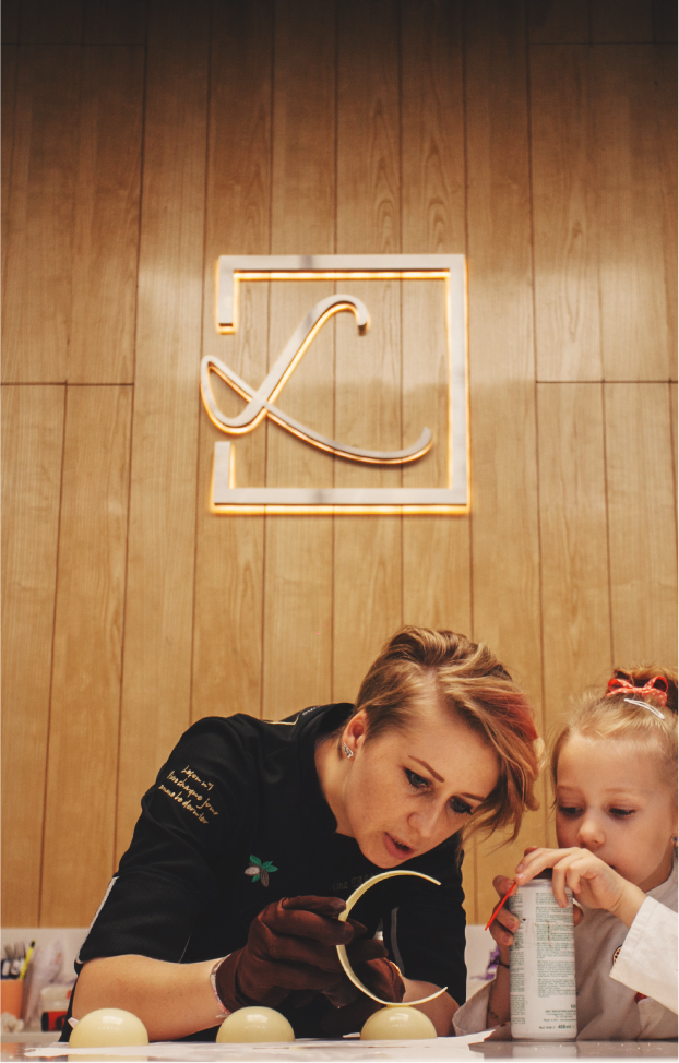
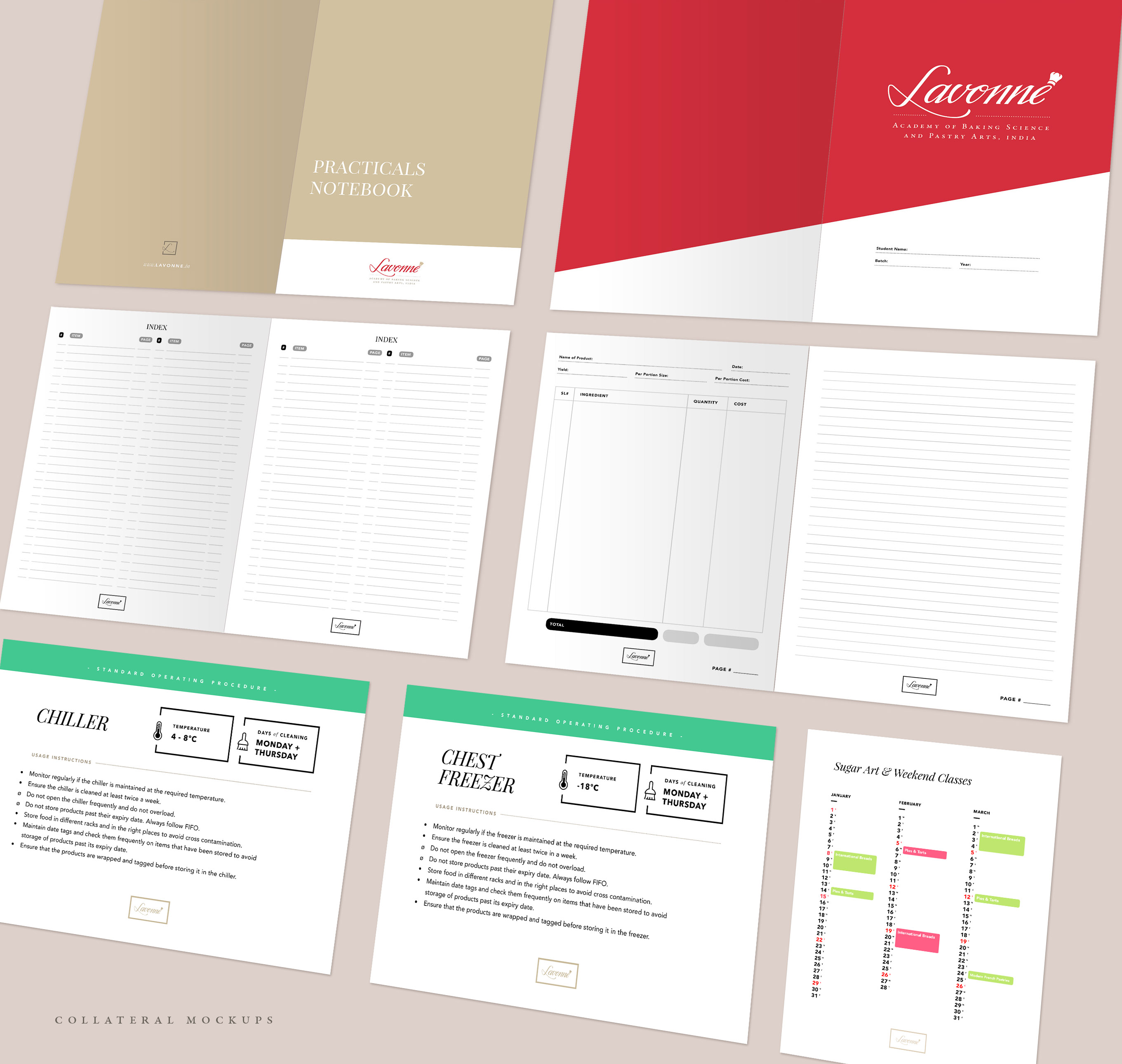
Branding is fluid. Especially with large institutions like hotels or academies, smart branding needs to be flexible enough to look beautifully grand on signage, and gracefully scale down for smaller usage like packaging and uniforms, or even chocolate tiles like in the case of Lavonne’s signature L icon.
Beyond the logo itself, the elegant typography and palette of red and gold and muted browns extended into books, stationery, and the interior decoration of the Bengaluru campus itself.
Beyond the logo itself, the elegant typography and palette of red and gold and muted browns extended into books, stationery, and the interior decoration of the Bengaluru campus itself.