Phoenix Building Systems
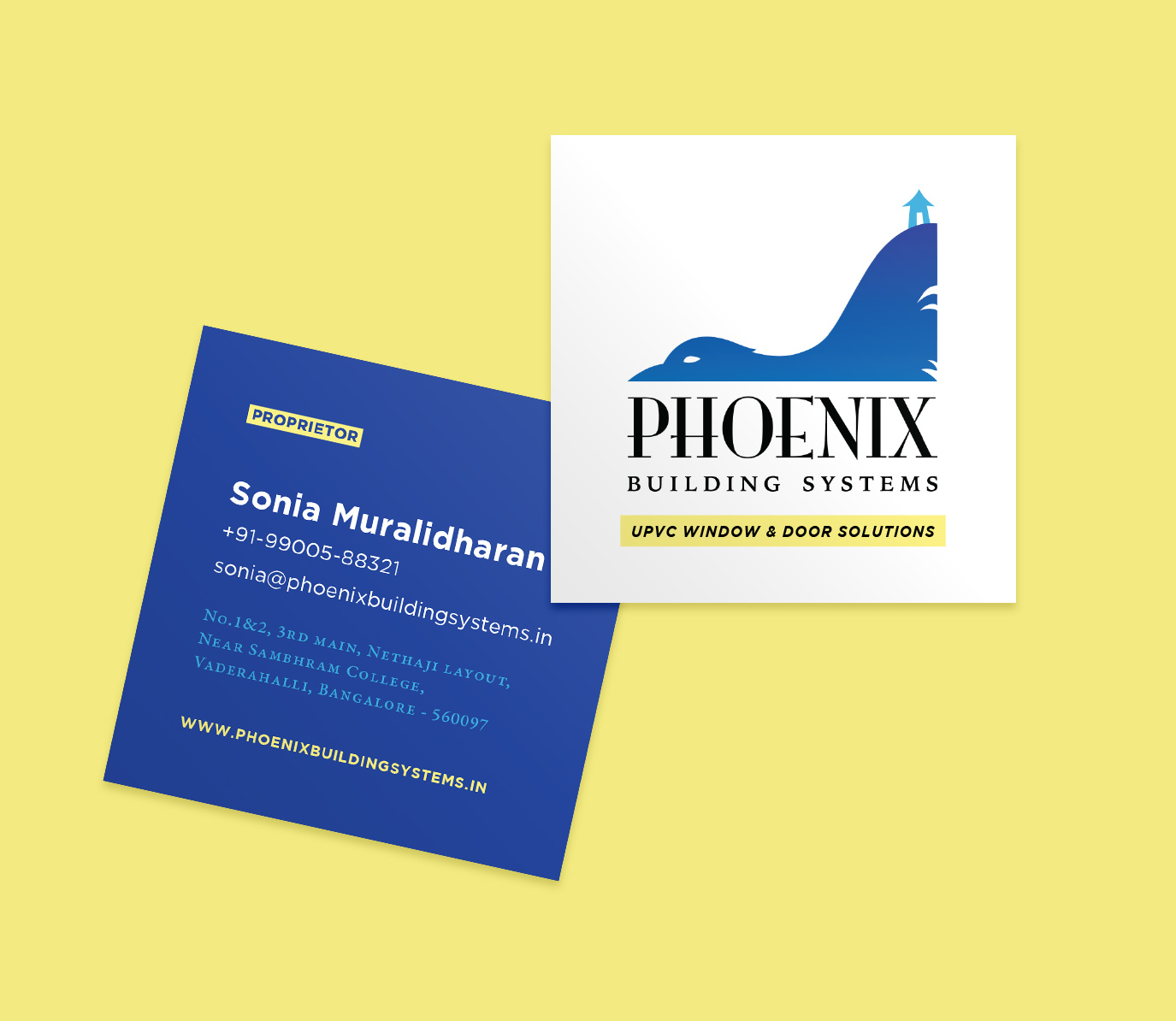
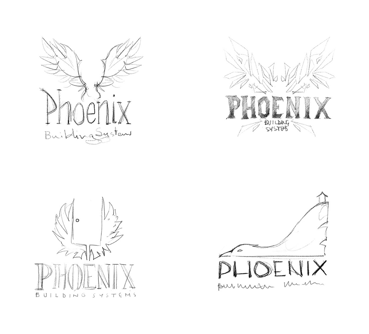
Bangalore-based Phoenix Building Systems really cares about the materials used in the construction of homes, and how it affects the people who dwell in them. They wanted a smart and interesting brand identity that would bring their youthful energy to a field that’s usually dominated by boring paperwork.
The logo emerged from the name itself, a phoenix forms the hill upon which a house rests, set in an arresting blue. Paired with bright, human-centric imagery, and clean typography, we built a simple and functional website at www.phoenixbuildingsystems.in
The logo emerged from the name itself, a phoenix forms the hill upon which a house rests, set in an arresting blue. Paired with bright, human-centric imagery, and clean typography, we built a simple and functional website at www.phoenixbuildingsystems.in